Customers have different expectations when they’re immersed in a 10’ screen experience versus a web or mobile screen. The following principles should always be kept in mind when designing.
Depth, Not Overload
Experiences should have less actions per page and push users to dive deep into their experiences as opposed to a bunch of actions on one page. Actions presented on one screen should be only two–three button presses away.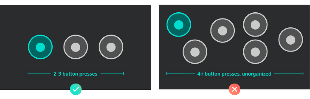
Screen Clarity
Focused and unfocused states should be ultra-explicit to give the user a sense of place and to know what they can interact with at all times. Using scale, color, and transparency can greatly increase the user's understanding of what action they are highlighted on.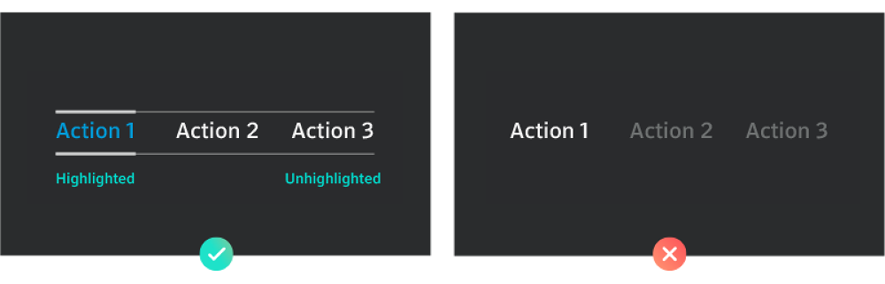
Limited Input
While device inputs are evolving, television's baseline is simple and primitive. To help improve predictable and simple interactions, we leverage cross-hair techniques. By using column or row stacks in a consistent manner, the learning curve is reduced.
Stay in the Box
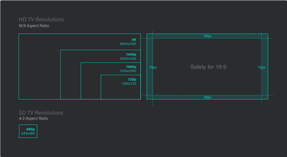
TV is designed using a 16:9 aspect ratio. Graphics will scale across screens of different sizes and resolutions—including standard definition—without adjusting content, meaning that what is seen on a 720p television will be the same on a 4K television. There is a minimum amount of padding (safety) on all screens to prevent design elements from being cropped off of the edges of the screen.