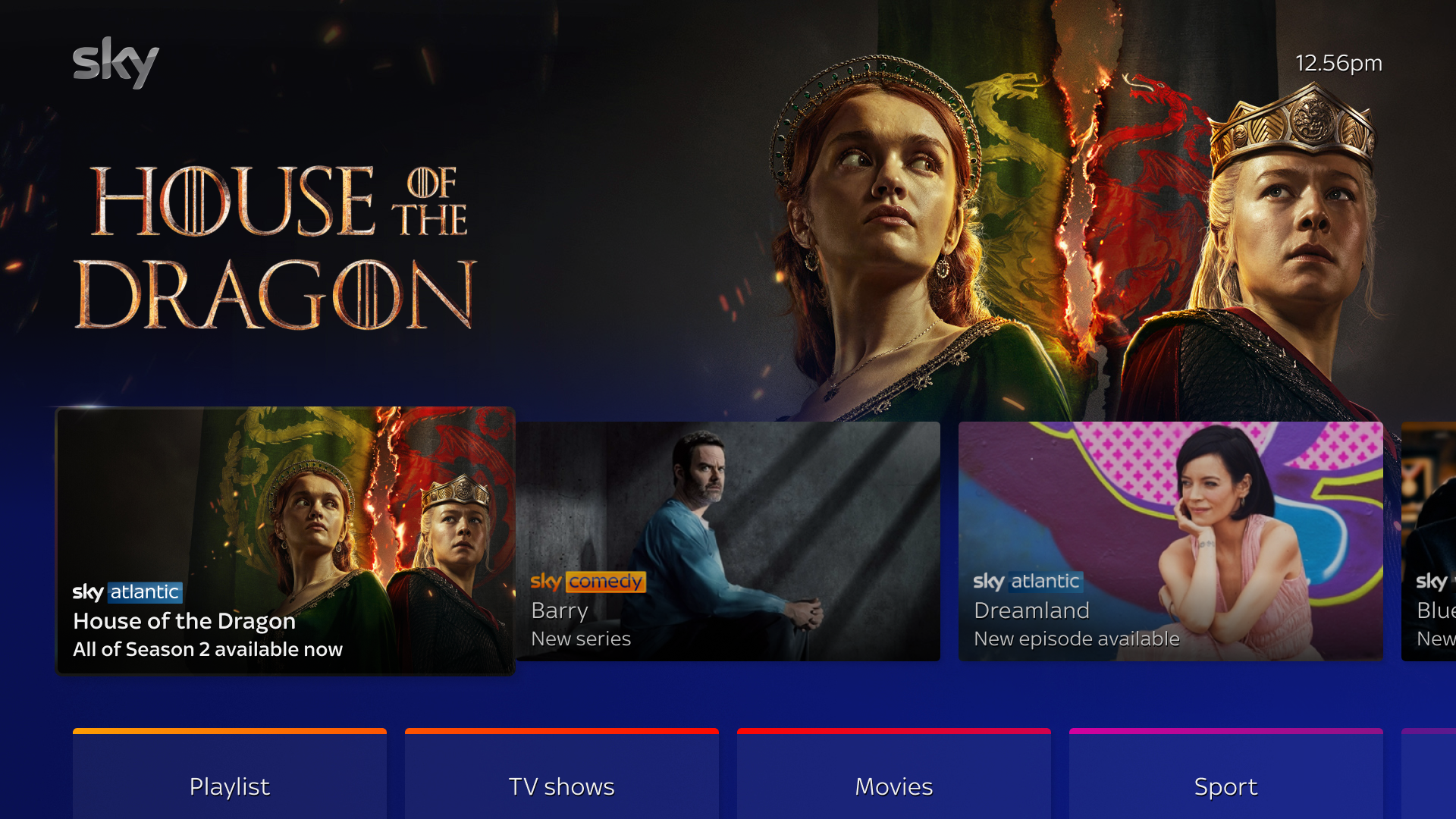
The Entertainment OS (EntOS) platform requires a variety of artwork to help users discover new content and provide quick access to the apps they regularly use. This document is intended to provide editorial guidance to broadcasters and other partners who supply programming to the platform. Following these guidelines ensure that your app and content are recognizable and appealing to consumers.
Additionally, the platform reserves the right to remove any images that receive complaints or that we believe may cause offense until a more appropriate image is sourced.
App artwork
All app artwork assets in this section are required to onboard your app for EntOS devices.
If you are onboarding your app for X1 and Flex devices, you must also provide the specified app tiles for X1 and Flex.
Aesthetic and color
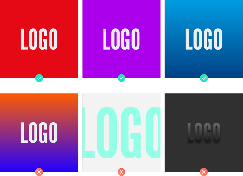
Your app deserves the opportunity to stand out in EntOS. Users should be able to quickly scan a screen of tiles and find your app. We recommend using your brand color as a backdrop to your app tile, with your logo knocked out in white. Gradients are sometimes used in a brand’s identity; we suggest toning down extremely busy gradients in favor of a simpler gradient. Your app tile should not try to replicate any real-life textures (skeuomorphism) and should be as simple as possible.
All tiles must have squared corners. EntOS handles the focus state by applying a top and bottom white border on tiles, rounded corners would leave a visual gap on edges.
Make sure that your colors align with WCAG AAA compliance for large text accessibility standards. To check your color contrast, visit WebAIM’s Contrast Checker.
App tiles
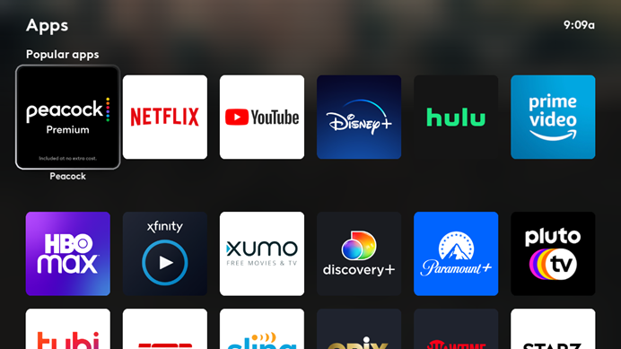
Square app tile
An app’s square tile is a 1:1 ratio, and is shown on any app rail or section.
Asset Type | Ratio | Resolution | Format | Mode | File Size Limit |
|---|---|---|---|---|---|
Square App Tile | 1:1 | 800 × 800 |
| RGB | 500 kb |

Landscape app tile
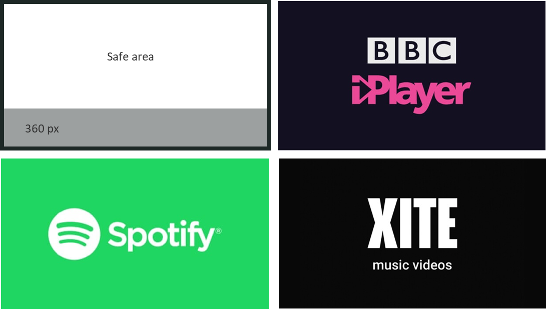
The app’s landscape tile is shown on the app switcher rail and can be used as a splash screen. The alternate landscape tile is used in Comcast’s EMS and the app marketplace.
While you can have your background or logo full bleed, we recommend against it for the purpose of legibility. Additionally, the landscape tile can have metadata overlaid, so it is important to keep your logo inside of the safe area.
Asset Type | Ratio | Resolution | Format | Mode | File Size Limit |
|---|---|---|---|---|---|
Landscape | 16:9 | 1920 × 1080 |
| RGB | 500 kb |
Alternate Landscape | 16:9 | 900 × 507 |
| RGB | 500 kb |
App tile sizing
To ensure that your tile is balanced with others in EntOS, frame your logo with these steps.
Draw a rectangle around the mass of your logo.
Take the width (x) of the rectangle and divide it by the height (y).
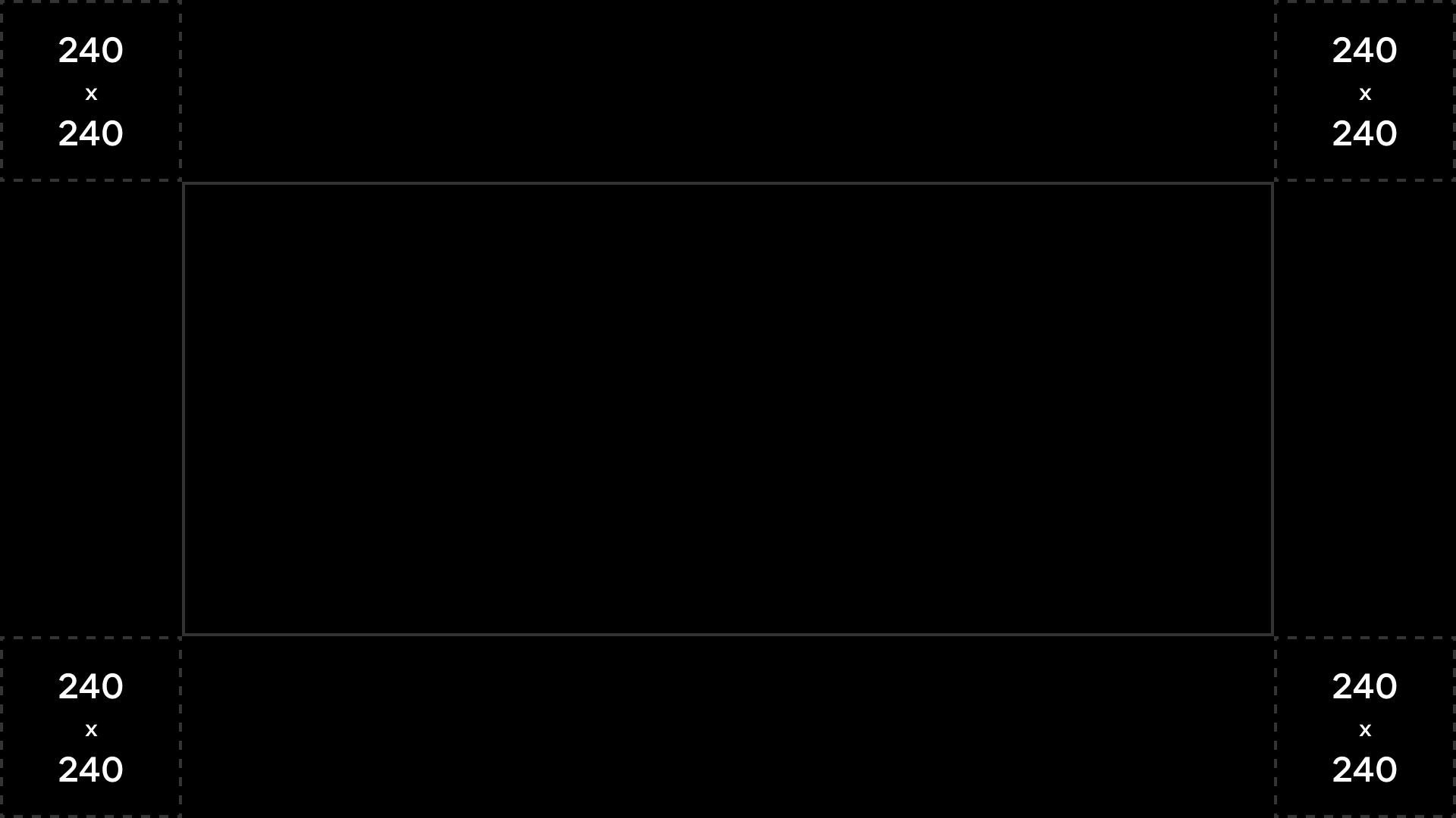
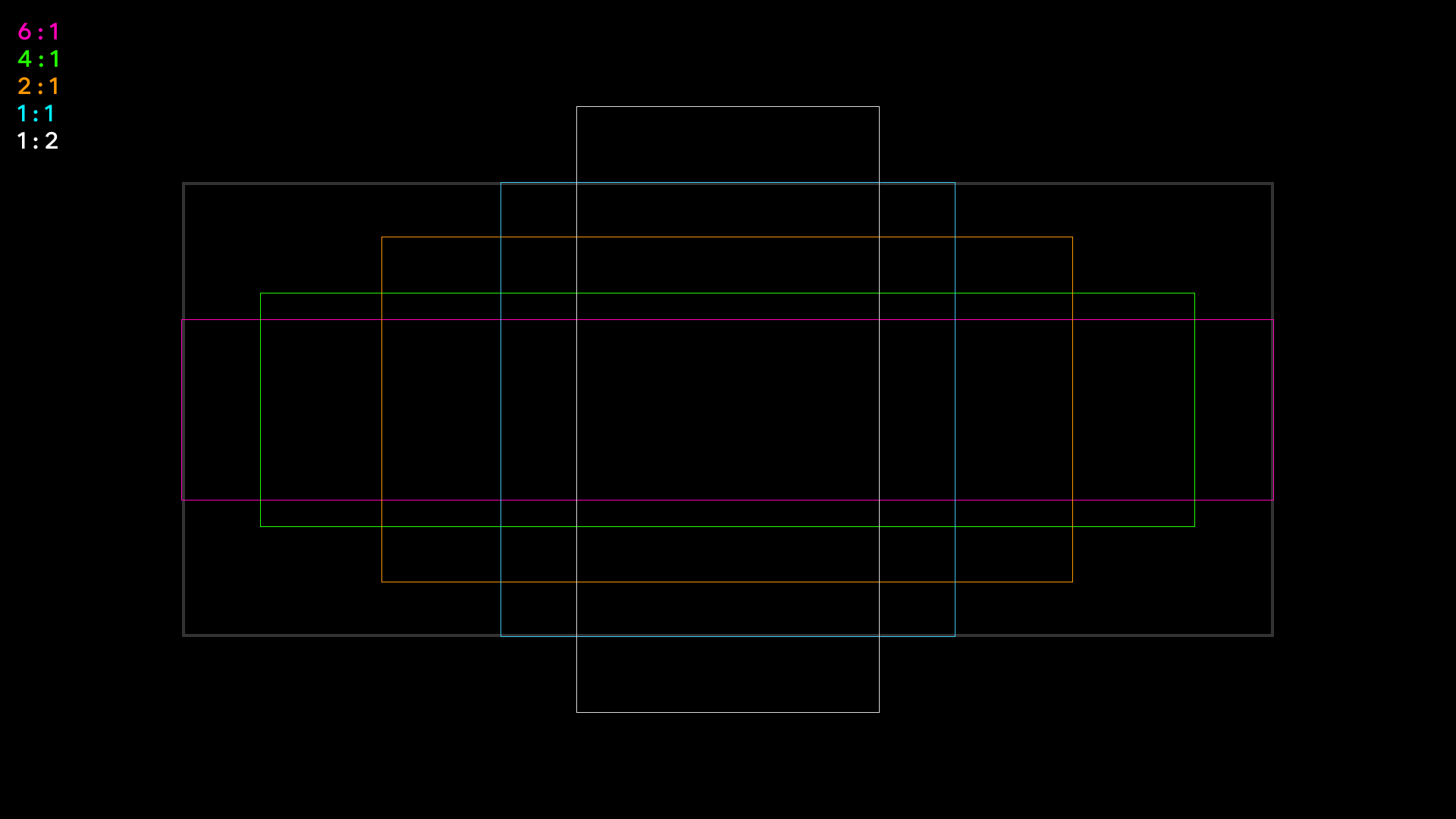
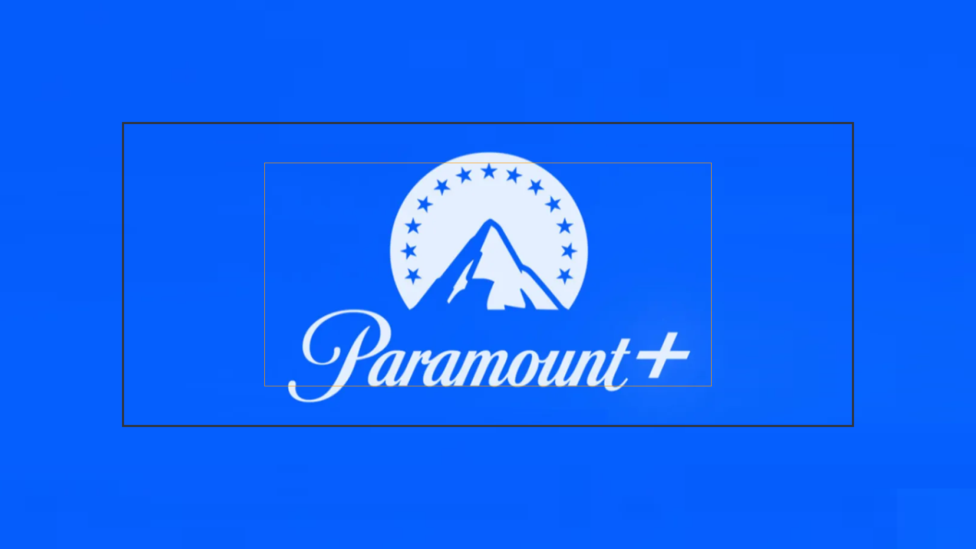
The result will be the ratio of your logo. Place your logo using the closest ratio available, while leaving some pixels of clear space from every edge. Leave 100 pixels for square tiles, and 240 pixels for landscape tiles.
In the example below, the logo fits into a rectangle that is 85 by 50 pixels. This is a ratio of 1.7:1 - with the closest ratio being 2:1.
Clear space | Ratios |
|
|
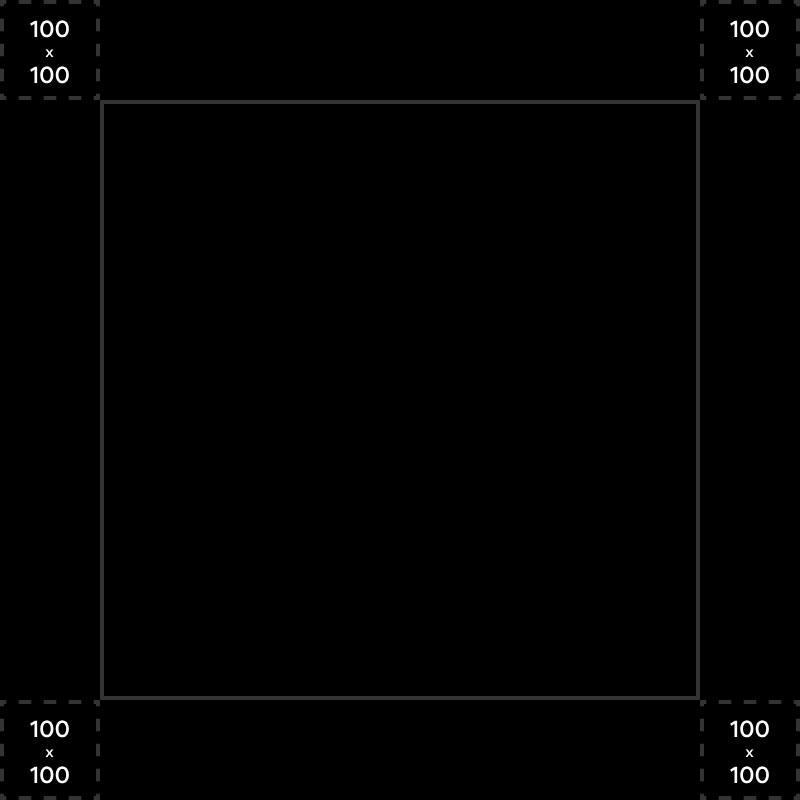
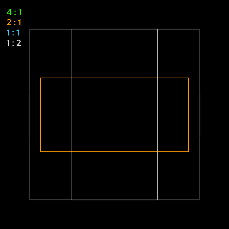
Original Logo | Logo in 2:1 frame | Final result |
|
|
|
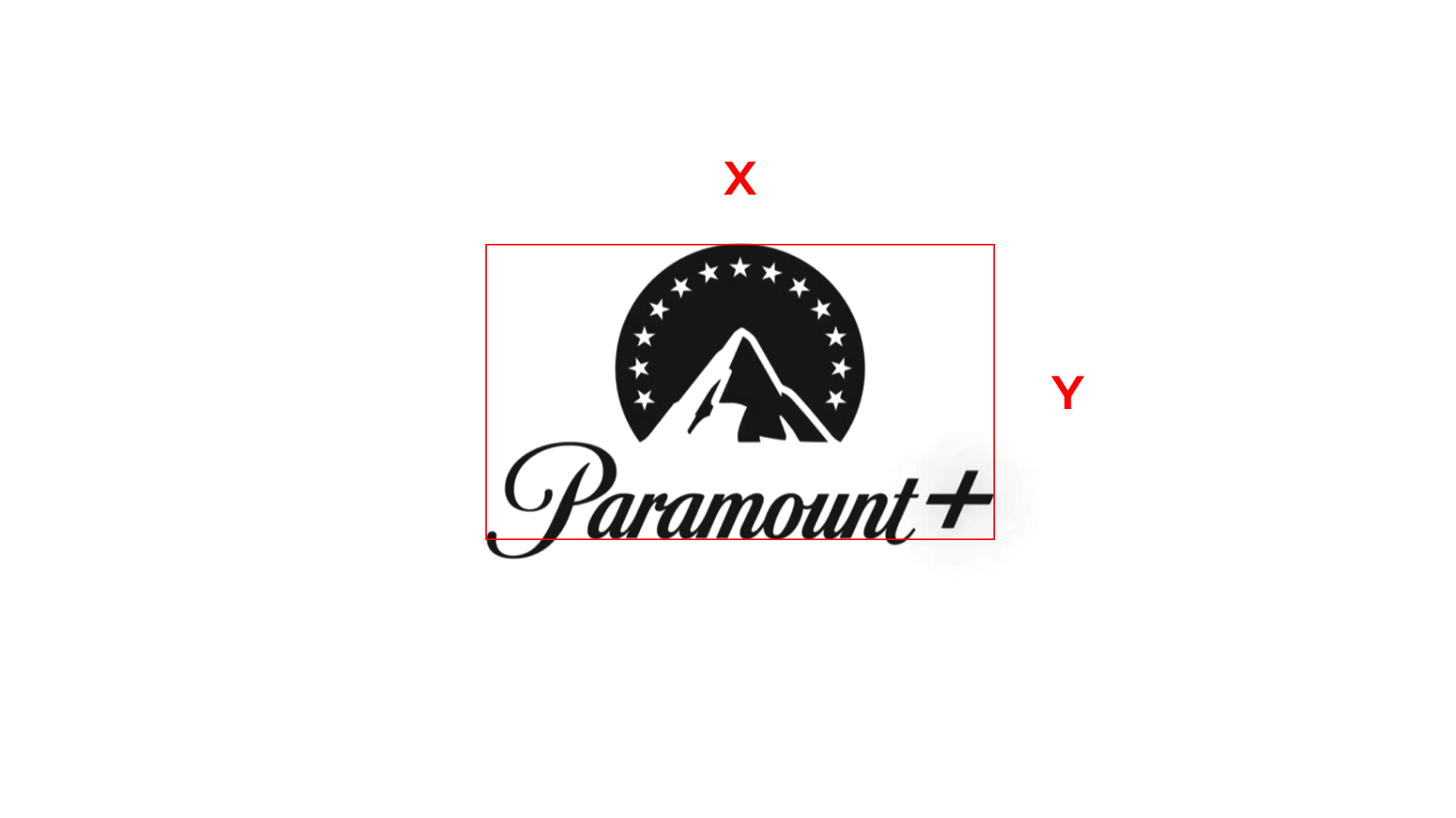
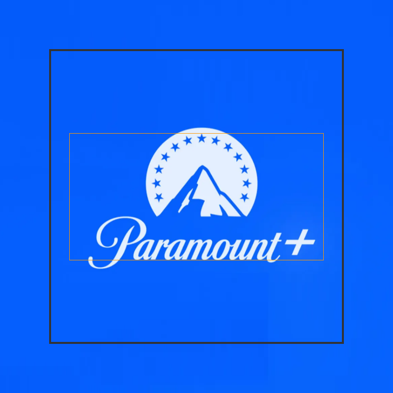
Clear space | Ratios |
|
|
Original Logo | Logo in 2:1 frame | Final result |
|
|
|
App hero images
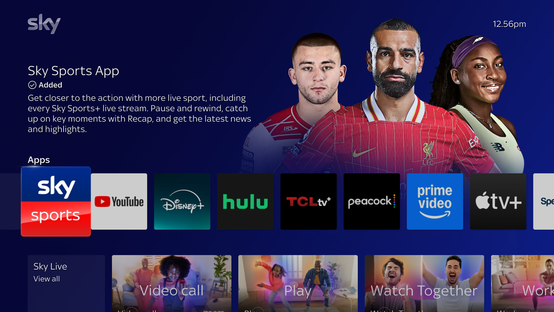
The app’s hero image is presented alongside the title art and synopsis when the app is focused.
App synopses are required
All apps should have a synopsis to comply with our platform feature requirements. For more information on synopsis specifications, please refer to our App Synopsis Requirements. An app synopsis example can be found on our UI Examples page.
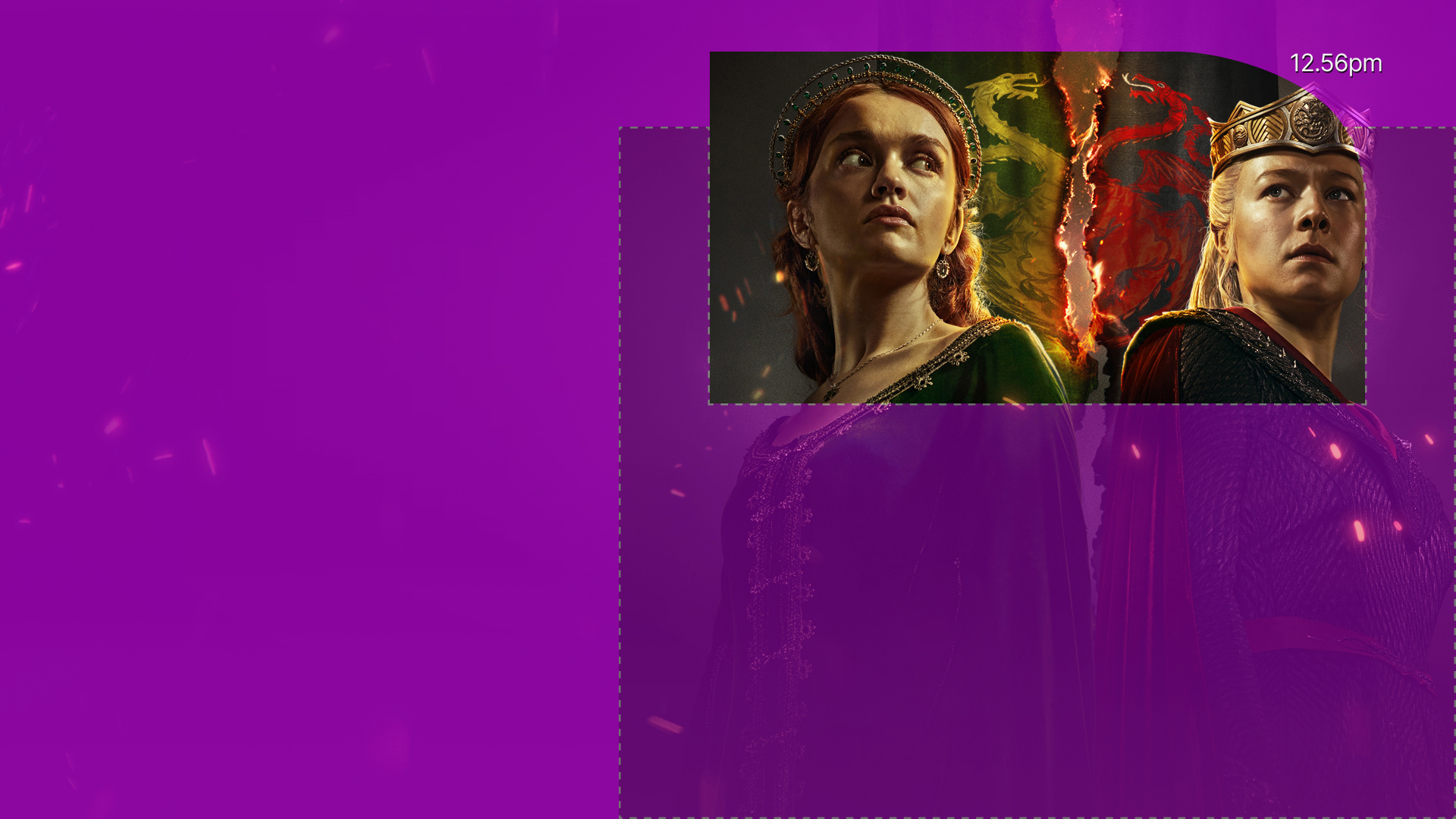
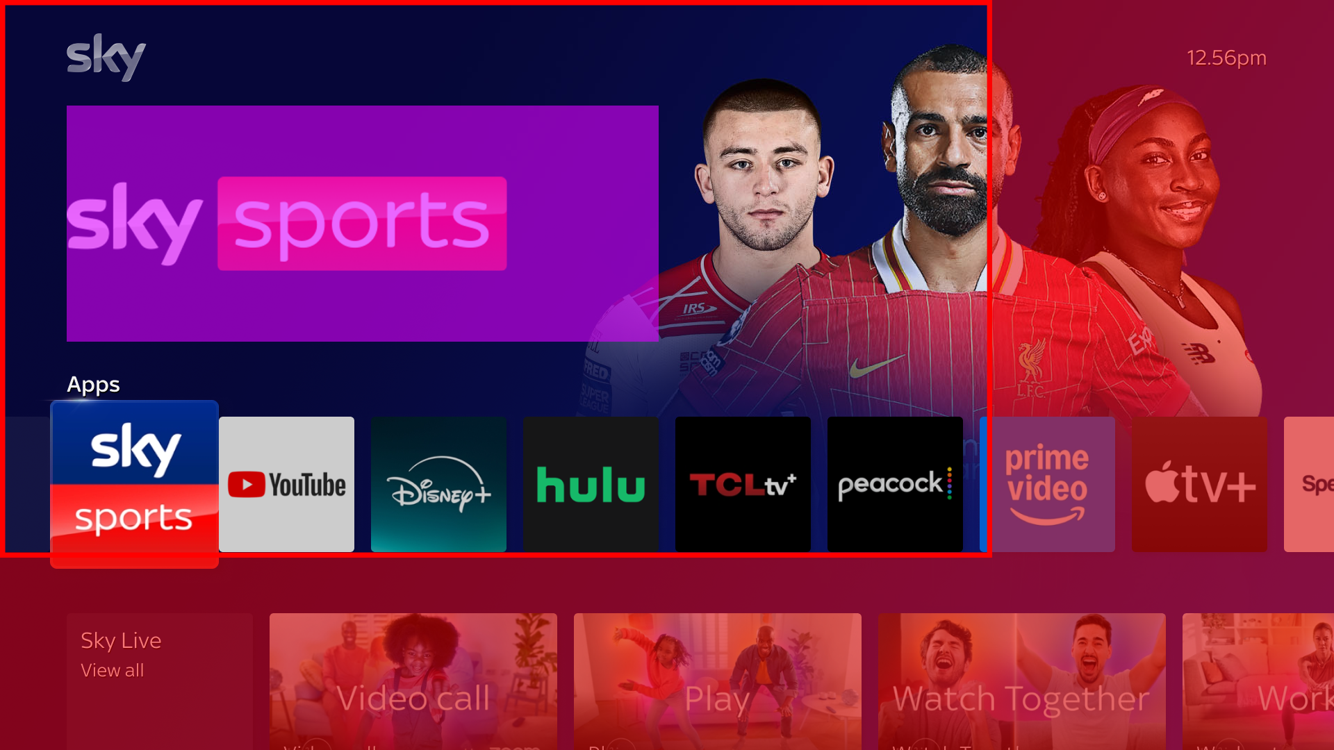
The hero image is full bleed, and automatically has a synopsis mask applied to it. When selecting an image to use as a hero, ensure that the main subject is placed in the safe cutout area focused toward the upper right. Secondary material should be placed in the dark purple area, and any tertiary material should be in the light purple area as shown in the image below. Prefer using dark colors, as lighter colors can cause the synopsis to become illegible.
Asset Type | Ratio | Resolution | Format | Mode | File Size Limit |
|---|---|---|---|---|---|
App Hero Image | 16:9 | 1920 × 1080 |
| RGB | 500 kb |
App title art
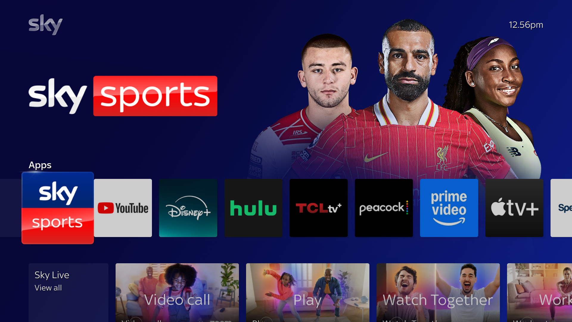
The app’s title art is briefly shown when your app is focused on the rail; it then transitions into the synopsis.
There are three sizes of title art that are acceptable for EntOS:
Size One is 1428 × 803 pixels. However, the title art will not be full size in the container. The title art will be closer to an actual size of 852 × 340 pixels. Regardless of how large your image is, it must be at least 96 pixels from the left of the container. Additionally, it must be placed in the upper left quadrant in the container.
Size Two is 1800 × 1000 pixels. This size is cropped to fit the visible area as shown in the example. Your image should ideally be left-aligned. It is not necessary for the logo to be the full size, as long as the image is either 1800 pixels tall or 1000 pixels wide it will work.
The alternate size is 365 × 205, and appears similarly to Size Two.
For all sizes, your title art should be legible over the hero image, as well as being vertically centered.
Asset Type | Resolution | Format | Mode | File Size Limit |
|---|---|---|---|---|
App Title Art (Size One) | 1428 × 803 | Transparent 24-bit | RGB | 500 kb |
App Title Art (Size Two) | 1800 × 1000 | Transparent 24-bit | RGB | 500 kb |
App Title Art (Alternate) | 365 × 205 | Transparent 24-bit | RGB | 500 kb |
.png)
App UI View
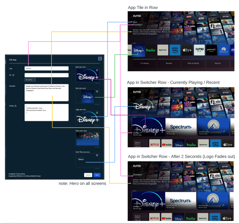
This section shows how the images you provide for your app will appear to our users. Note that the image below uses Disney+ as an example app. The following image types are used in the order of appearance:
Content artwork
The following images are necessary to show specific content from your app to Entertainment OS users, whether that is on the home page, search section, or a rail.
Content hero image
The content hero image is presented alongside the title art and synopsis when content is focused.
Content synopses are required
All content should have a synopsis to comply with our platform feature requirements. For more information on synopsis specifications, please refer to our Content Synopsis Requirements. A content synopsis example can be found on our UI Examples page.
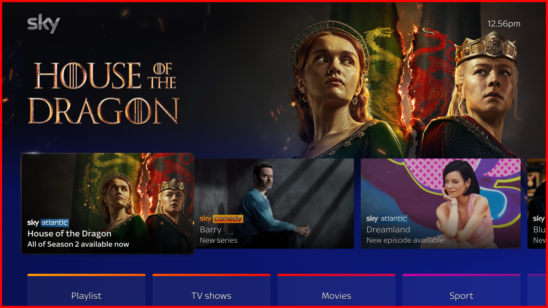
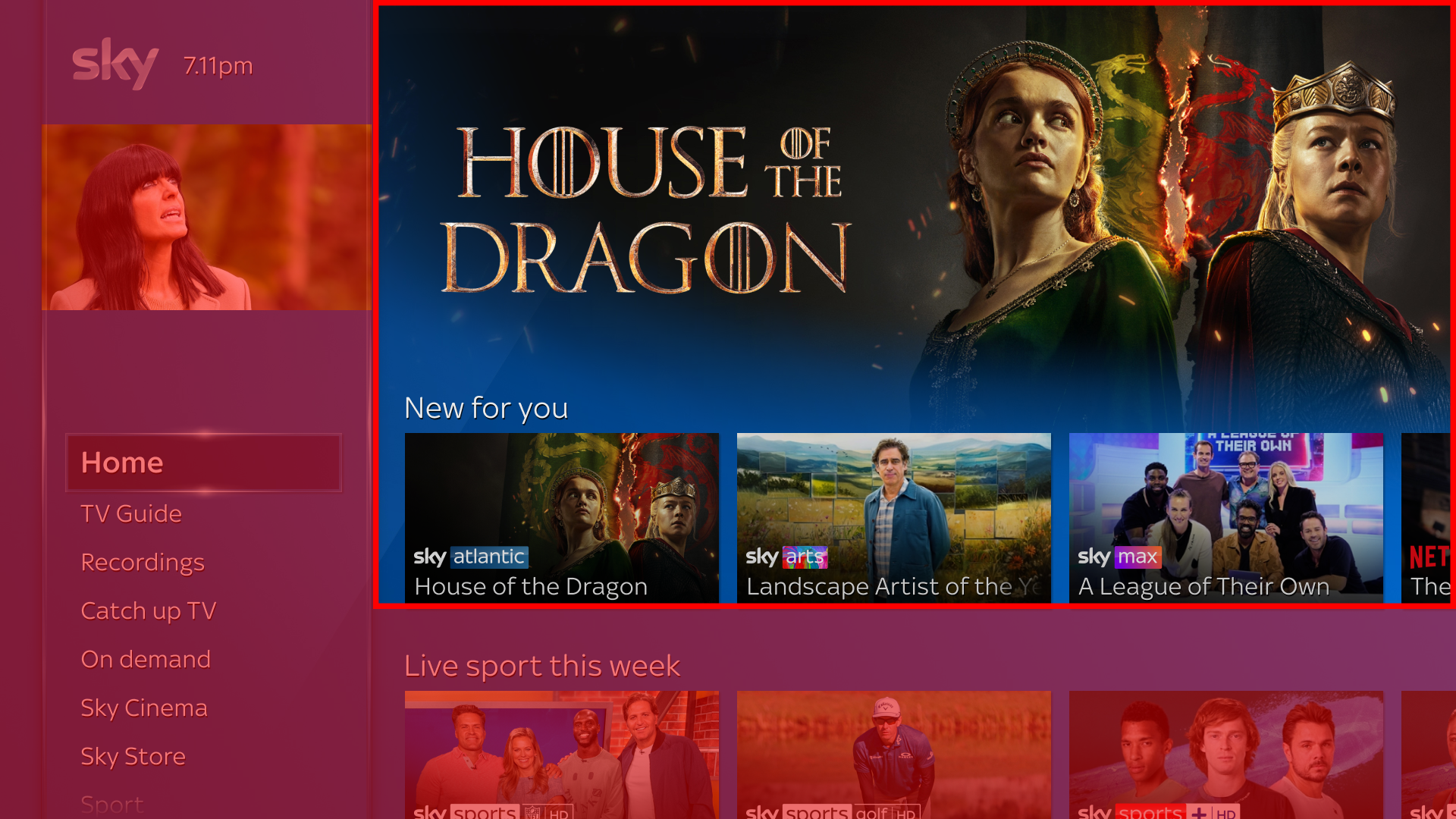
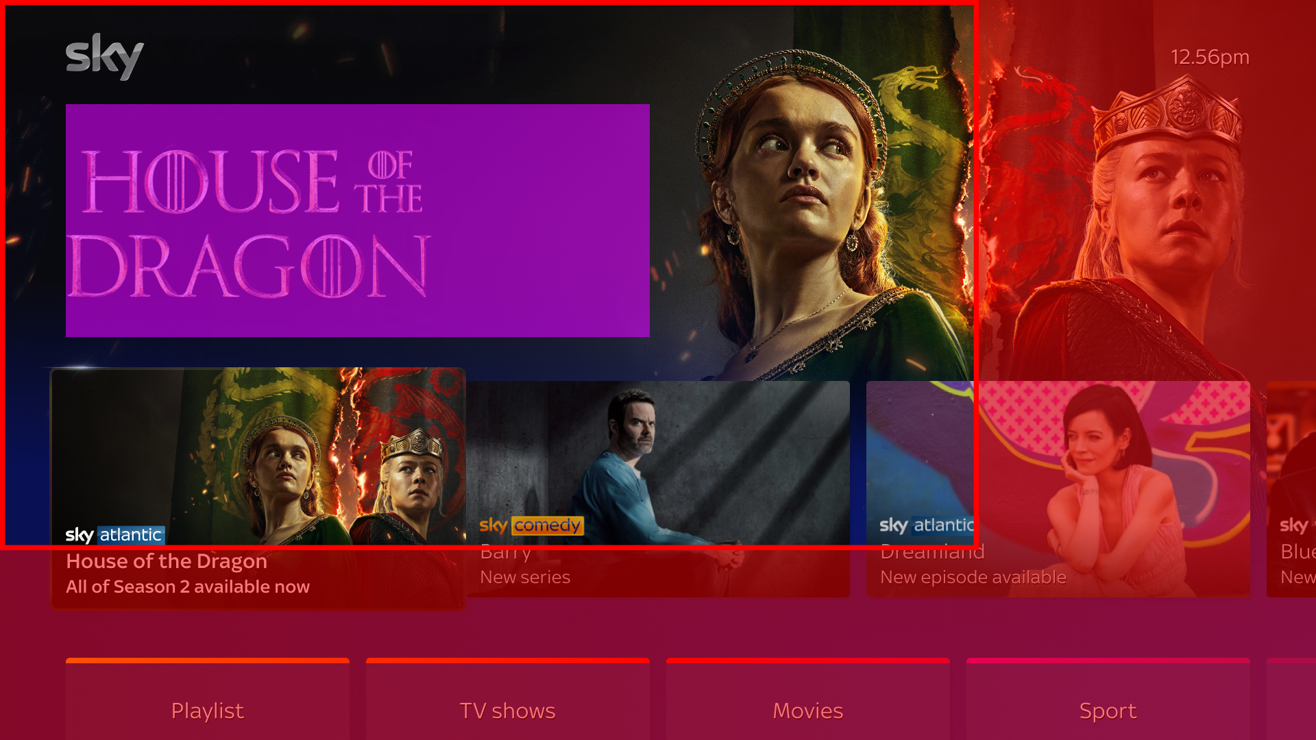
When selecting an image to use as a hero, ensure that the main subject is placed in the safe cutout area focused toward the upper right. Secondary material should be placed in the dark purple area, and tertiary areas in the light purple area as shown in the image below. Prefer using dark colors, as lighter colors can cause the synopsis to become illegible. There are 9 masks that can be applied to the hero image, and we have provided some examples of them below to demonstrate why the safe area matters.
Asset Type | Ratio | Resolution | Format | Mode | File Size Limit |
|---|---|---|---|---|---|
Content Hero Image | 16:9 | 1920 × 1080 |
| RGB | 500 kb |
.jpg)
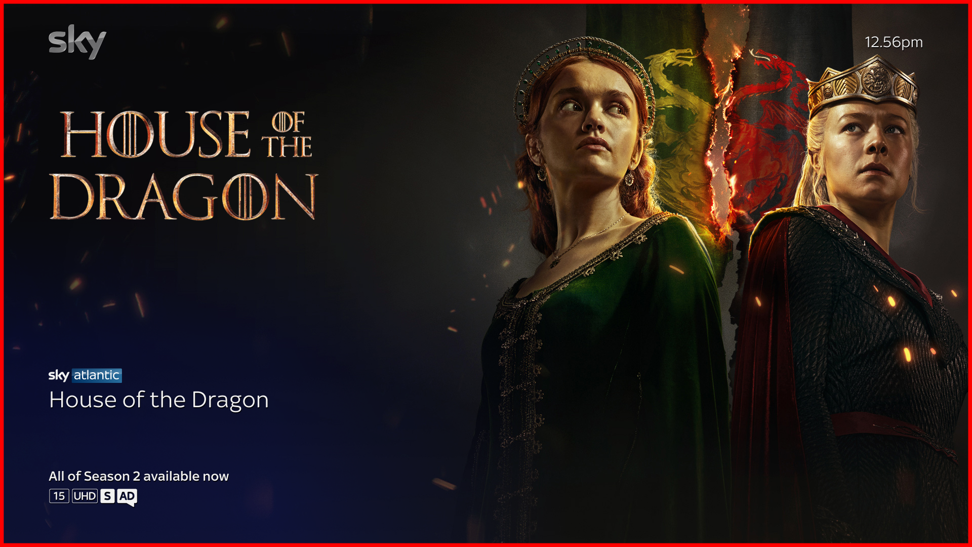
Content title art
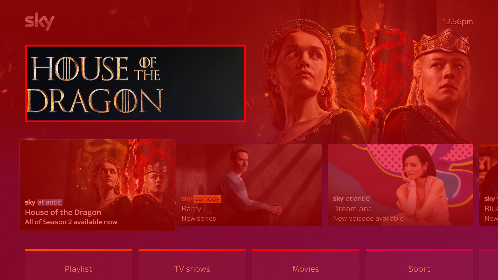
The content’s title art is briefly shown when it has focus on the rail; it then transitions into the synopsis.
There are two sizes of title art that are acceptable for EntOS:
Size One is 1428 × 803 pixels. However, the title art will not be full size in the container. The title art will be closer to an actual size of 852 × 340 pixels. Regardless of how large your image is, it must be at least 96 pixels from the left of the container. Additionally, it must be placed in the upper left quadrant in the container.
Size Two is 1800 × 1000 pixels. This size is cropped to fit the visible area as shown in the example. Your image should ideally be left-aligned. It is not necessary for the logo to be the full size, as long as the image is either 1800 pixels tall or 1000 pixels wide it will work.
For both sizes, your title art should be legible over the hero image, as well as being vertically centered.
Asset Type | Resolution | Format | Mode | File Size Limit |
|---|---|---|---|---|
Content Title Art (Size One) | 1428 × 803 | Transparent 24-bit | RGB | 500 kb |
Content Title Art (Size Two) | 1800 × 1000 | Transparent 24-bit | RGB | 500 kb |
Channel/brand logo
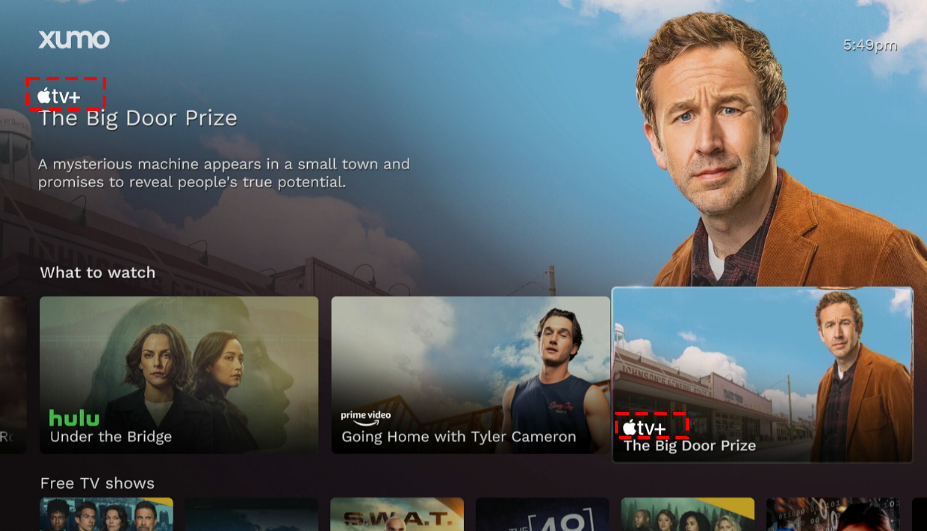
The channel/brand logo is displayed above the synopsis of content, and it often appears with metadata on top of landscape show level images.
It’s important to ensure the logo is legible on dark or blue backgrounds. The image will be resized on the EntOS platform to ensure it is proportional to other logos.
Asset Type | Ratio | Resolution | Format | Mode | File Size Limit |
|---|---|---|---|---|---|
Brand logo | 1:1 | 2000 × 2000 | Transparent | RGB | 500 kb |
Landscape show level
These images are used when needing to blend content within rails or search results.
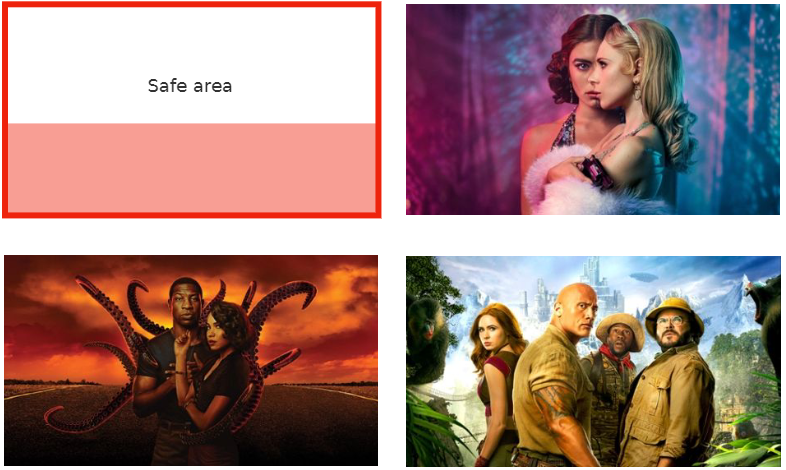
This artwork must be free of any title art or badging. The bottom third of the image will contain interface elements, so keep important imagery in the upper safe area.
Asset Type | Ratio | Resolution | Format | Mode | File Size Limit |
|---|---|---|---|---|---|
Landscape show | 16:9 | 1920 × 1080 |
| RGB | 500 kb |
Landscape episode level
Once the user selects show-level content, they are able to browse through the episodes.
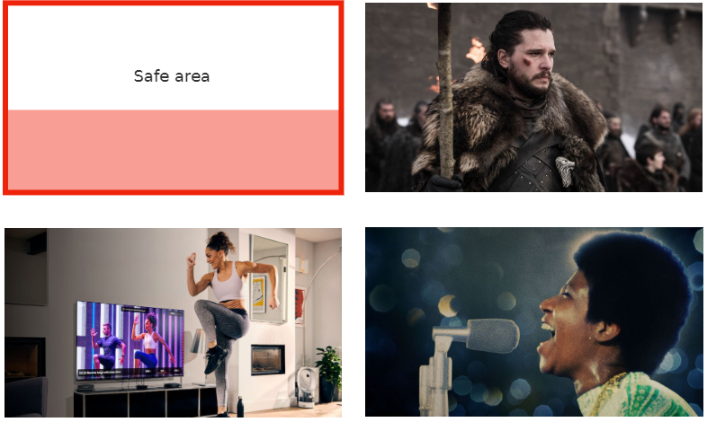
This episode level imagery must be unique, as it represents individual episodes. This artwork must be free of any title art or badging. The bottom third of the image will contain interface elements, so place important areas inside the safe area.
Asset Type | Ratio | Resolution | Format | Mode | File Size Limit |
|---|---|---|---|---|---|
Landscape episode | 16:9 | 1920 × 1080 |
| RGB | 500 kb |
Landscape with title art
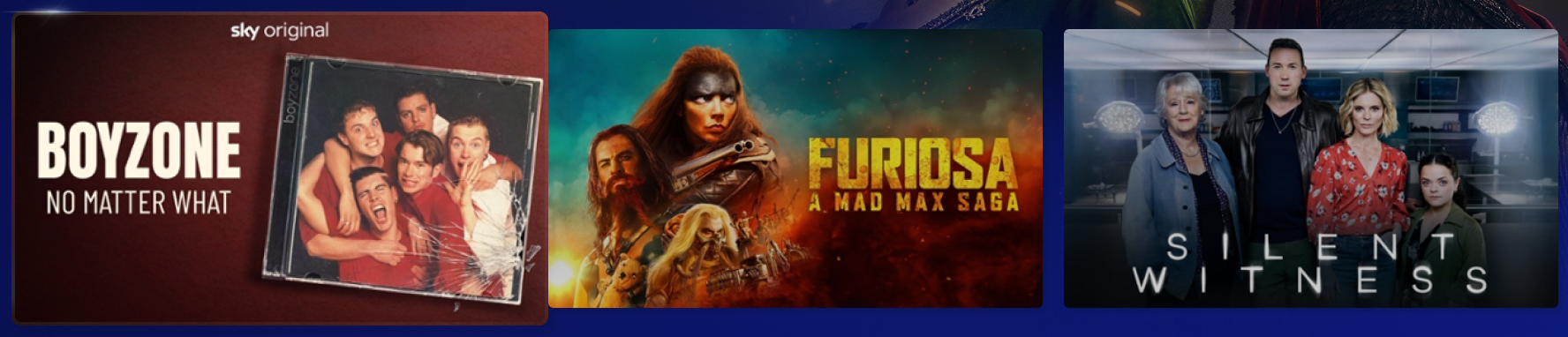
The landscape title art is an alternative landscape tile shown on rails that lack metadata. The image must have title art included.
Asset Type | Ratio | Resolution | Format | Mode | File Size Limit |
|---|---|---|---|---|---|
Landscape title art | 16:9 | 1920 × 1080 |
| RGB | 500 kb |
Portrait with title art
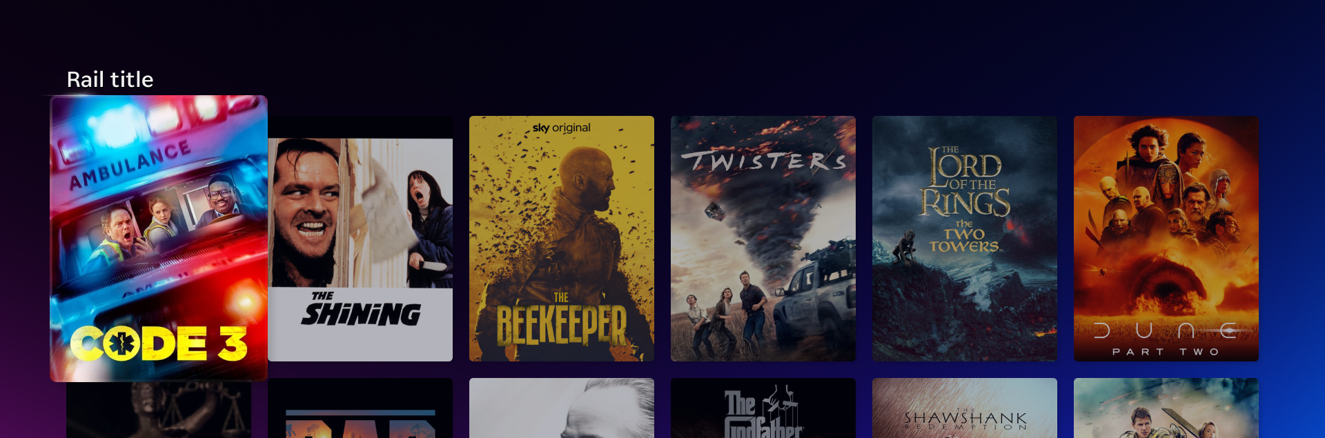
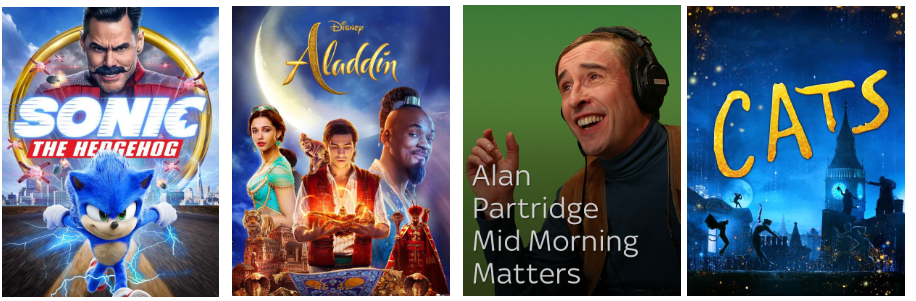
Portrait titles are used when users browse through movies, television series, and box-sets.
Metadata are not shown automatically on the 3:4 tiles, so titles must be in the artwork itself. Any text or copy should be inset by 30 pixels from all edges and have less than 4 lines. Any brand logo, if applicable, should be at the top of the portrait and centered.
Asset Type | Ratio | Resolution | Format | Mode | File Size Limit |
|---|---|---|---|---|---|
Portrait | 3:4 | 600 × 800 |
| RGB | 500 kb |
Legacy artwork
The image types listed below are required for older devices and legacy platforms, but are not supported on Entertainment OS devices.
App tiles for X1 and Flex
X1 and Flex devices use the below unique app tile sizes that differ from those used for EntOS devices.
Asset Type | Ratio | Resolution | Format | Mode | File Size Limit |
|---|---|---|---|---|---|
Small square app tile | 1:1 | 260 × 260 |
| RGB | 500 kb |
Large square app tile | 1:1 | 3840 × 3840 |
| RGB | 500 kb |
Small alternate app tile | 1.55:1 | 214 × 138 |
| RGB | 500 kb |
Large alternate app tile | 16:9 | 1920 × 1080 |
| RGB | 500 kb |